Blog 3 Part I: Mini Art School
Blog #3 Part I: Mini Art School
Mini Art School Activity #1: Repetition page 58
I decided to try the activity on page 58 that covered the design concept of repetition. The key to this particular activity was to use repetition to "establish visual harmony and attracting notice" (Krause 2004). I was tasked with creating 3 different approaches to the same ad using repetition of the same image in the ad. In my particular pretend ad, I was trying to sell a painting class that meets on Thursdays at 2 pm. My three attempts are listed below.
Version #1

Version #2


I used the colors from the images to try to keep the text uniform with the images. I think the one that accomplishes the use of repetition to maintain harmony is the first one. "Visual harmony means the agreement between elements both aesthetically and thematically" which I think is best reflected in the first one (Krause 2004). The images are more connected to the text. I also tried to adhere quite closely to the rule of not using too many colors in the design which is why I connected the color of the text to the images to increase the harmony. I also tried to have the image repeat in a way that creates a visual discord by breaking apart the words but maintain harmony. I used "repetition as the focal image" because I felt that the painted leaves would capture the attention of the audience (Krause 2004). Repetition in this case was used "gain notice and prompt viewers to investigate" (Krouse 2004). This would help my new painting class gain notice and attention so that people can participate in it. The information is also separated in a way that forces the user to look at them separately. This is two different pieces of information being presented to the viewer. I think that this more closely conveys the harmony created by repetition than the other two.
Mini Art School Activity #2: Mini Compositions p. 71
After completing my first compilation of a dozen composition designs, I came to this result.

This was a very interesting exploration of how placement, size, shading, and form could impact the over all look of the image. Each composition is made up of essentially the same shapes but because of these small changes, I have essentially created 12 different compositional possibilities for my final piece. Each has its own unique personality and emphasizes something different as a result. This design activity is heavily influenced by the idea that "Graphic Design is planned" and "small sketches called thumbnail sketches help the designer establish attention grabbing focal points and determine the placement of the remaining elements for logical and effective order" (Golombisky &Hagen 2010).
Good Example of Design:
I decided to focus on the following example as a representative of good design.:
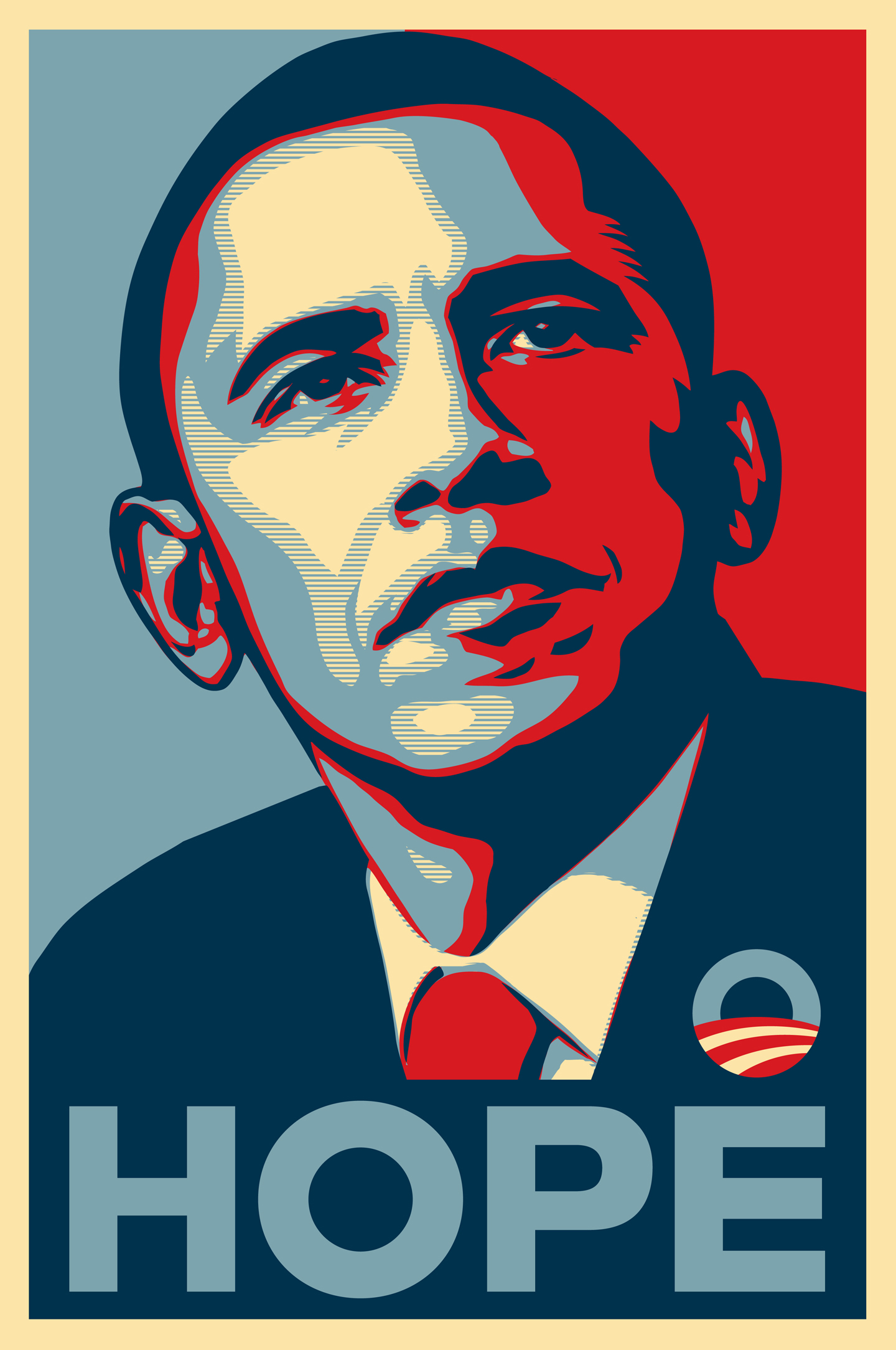
I decided to look closely at this particular poster that made its rounds during the 2008 elections made by Shepard Fairey (Arnon, 2008). It became a "pop cultural phenomenon and an important symbol in the political landscape of 2008 and beyond" so I wanted to examine it closely to see how well it adhered to our rules of design (Arnon, 2008). I wanted to figure out what made the design of this image so powerful aside from the political undertones. So I looked closely at the design rules that were established on our website and in our texts for any rules that may have been broken.
I think this particular artist kept the first rule of design noted in the video "Top 10 Rules of Design and When to break them" which was to restrict the number of colors to "2-3 colors." The artist restricts the color scheme to strictly red, blue, and yellow. The artist that created this graphic image with strictly these three colors.
I think that the artist who created this image knew that for a presidential candidate that the "design has to be practical" (Golombisky &Hagen, 2010). That was the second rule that the artist adhered to for success of this particular piece.
The next rule that this particular designer followed was using a minimal number of fonts because "it avoids confusion and each font has its own personality (10 Design Rules). The designer knew that the font was powerful enough to speak to the audience. This particular artist chose a font that references solidarity which is why a blocky more sturdy font was chosen.
In one particular case, the rule was broken for the placement of the logo on the image. "Logo should go on the top left" but instead it was placed on the bottom left (10 Design Rules). I think the reason this particular designer broke this rule was because it fits the overall shape better at the bottom left rather than the top left (10 Design Rules).
Another rule that this particular designer followed to create such a powerful image was the placement of the text against the background. Poorly chosen background against a text will create a lot of difficulty for the viewer and result in a situation of taking "a look at the text and see how long you want to read it against that... background" (Barron, 2015).
Another very interesting rule that was followed quite well in the design of this was that this image was "pleasing to the eye" (Barron, 2015). This designer followed this rule very well in ensuring that not a lot was happening in the image. The colors were bright but not overwhelming to the eyes. The designer avoided the craziness of bright colors which has "the purpose of all of that craziness is just to get your attention" (Barron, 2015). The image was subtle and ensure that the viewer received all the information about the candidate without being overwhelmed.
The designer also knew how to keep the image "appropriate to the topic" by representing the seriousness of the candidate (Barron, 2015). The artist did not place a lot of images on the poster that could represent the candidate in a poor way or reflect a lack of professionalism. The image "appeals to the audience" because it speaks " to the audience in its own visual vernacular" (Golombisky &Hagen, 2010).
In terms of websites, I think a great example is :
In this particular website a lot of the design rules are followed quite closely. They maintain "a easy to use layout" (Barron, 2015). The visitor can look through the artwork quite easily. The list on the side bar allows viewers to browse the images that have been posted to the website. The top bar includes "shop, forum, more, and submit" which might be the key activities needs to complete submissions on this website. The join and login buttons for members are kept to the side separate so that a visitor who wants to join can do so.
Another element they have mastered in this website is the lack of animations or flashy images aside from the artwork submitted by the members. The website ensures that the design elements" don't get in the way of the content" which in this case is member art (Barron, 20015).
I think both these examples successfully showcase how to use design to convey their message or purpose.
References
Arnon, B. (2008, November 13). How the Obama
“Hope” Poster Reached a Tipping Point and Became a Cultural Phenomenon: An
Interview With the Artist Shepard Fairey. Retrieved from HuffPost:
https://www.huffingtonpost.com/ben-arnon/how-the-obama-hope-poster_b_133874.html
Barron, B. (2015, April 25). Bad Web Design: A
look at the Most Hilariously Terrible Websites from Around the Web.
Retrieved from Elegant : https://www.elegantthemes.com/blog/resources/bad-web-design-a-look-at-the-most-hilariously-terrible-websites-from-around-the-web
Golombisky, K., & Hagen, R. (2010). White
Space is not your enemy. New York : Focal Press.
Top 10 Design Rules and When to Break Them (n.d.). [Motion Picture].
Comments
Post a Comment